Grant's financial Publishing
Grant's
Issue tab

Almost Daily Grant’s

Podcasts

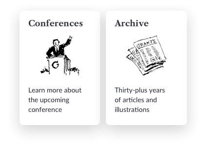
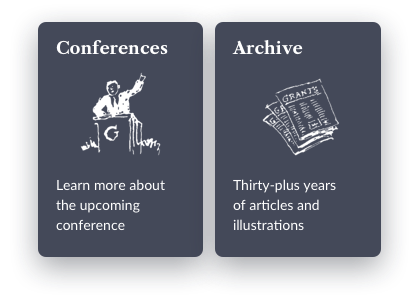
Conferences

Grant’s Highlight Reel
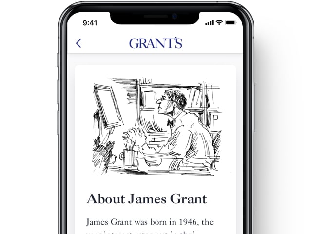
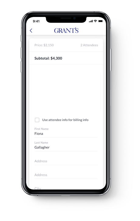
At the highest level, the app may be regarded as a collection of articles and podcasts. The main challenge was to find a way to provide vast quantities of information in such a way that the user would be able to navigate quickly and easily.
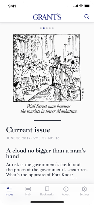
Mercury designers and analysts suggested rendering issues in a dedicated tab in a carousel manner, and show them grouped per year in a special Archive section.
 Designer, Mercury Development
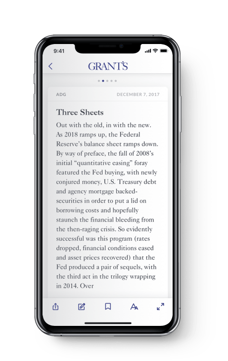
Working on this project was particularly challenging, because we had to preserve the journal's traditional and recognisable style, but also give it a fresh look and improve usability. We pulled this off by using laconic newspaper layout, subtle colors, and nice serif fonts in a combination with grotesques.
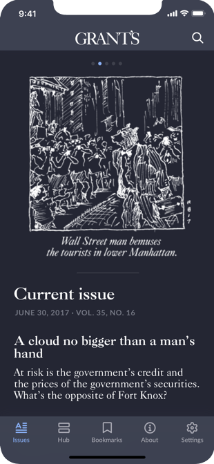
Day mode
Night mode
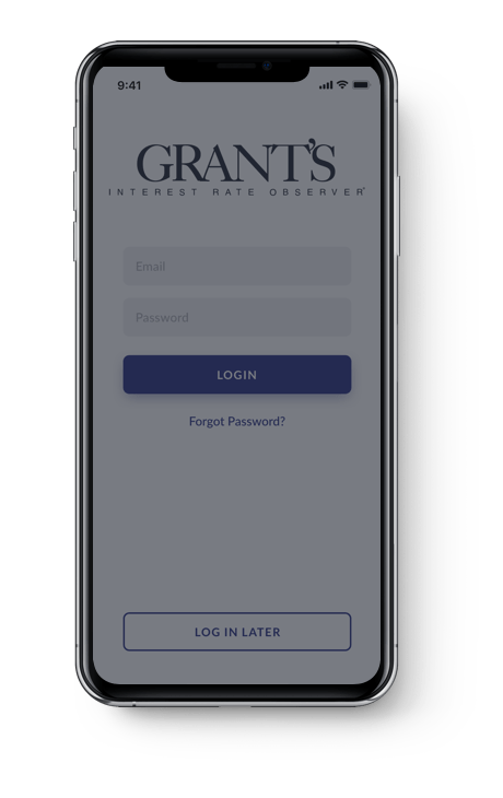
Colors & Fonts
Changing the app layout together with a color palette might be quite stressful for the user. We stuck to the main colors of the previous designs, but adjusted the hues and the fonts to improve the overall look and feel of the application.
Custom controls helped to maintain a well-rounded image of the app.
Another challenge was to bring into accordance was the phone and tablet layouts. The tablet design was elaborated separately combining the best of both worlds — intuitiveness and a larger screen.
In addition, the customer requested a few technical improvements.
All the designs and upgrades were implemented by our team and are now available for the users of Grant’s Interest Rate Observer.
 Controller, Periodical grant's
Although the app is still in beta testing, internal stakeholders have commended the app for its revamped visuals and intuitive functionality. Mercury Development continues to communicate consistently, meeting all expectations and adhering to established timelines.
See Also
GreenLinks
Thnks
iOS Apps
Have questions?
Feel free to contact us and we'll respond as soon as possible.